Date Posted: 09.13.2019
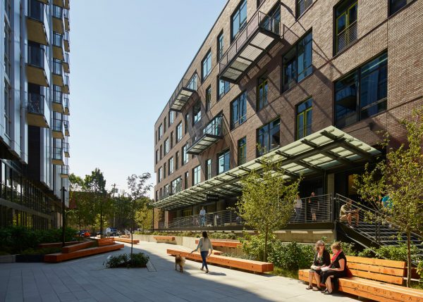
Portland’s popular and growing Pearl District presents two distinct styles: the historic industrial area with low rise brick warehouses and loading docks in contrast to the expanding residential heart with contemporary high-rise towers. The Heartline project, as a full block development, presented a unique opportunity and challenge to relate to both characteristics of the neighborhood and create a threshold zone. The design responds by dividing the site into thirds: two buildings of different architectural scale and style united by a public courtyard built over below-grade parking.
To respond to the differing characteristics of the neighborhood, an early concept was developed of the heartwood and the seedling. The 13th Avenue building responds to the large, low warehouses of the historic district with a five-story, brick structure with a long dock on either side. Like the heartwood—the hardest part of timber—the design of the building was meant to reference something that felt durable, mature and rooted in place. In contrast, the 12th Avenue building is much taller and of a contemporary design language aligned to the North Pearl District. This building represented a young seedling forest reaching up for light. The buildings are further distinguished by their uses. After hearing neighbors’ requests for more daytime activity in the neighborhood, Security Properties, the developer, chose the 13th Avenue building to be office space above retail. This is complemented by the 12th Avenue building, a tower of residential apartments over ground-floor amenity and office space.
This design concept left the challenge of how the public courtyard could mediate and unite the two distinct styles and create a unique open space unlike others in the neighborhood. The Pearl District provides numerous public open spaces—from large neighborhood parks to intimate courtyards between buildings. The design team spent time walking and sketching many of these spaces to observe how they were used and what qualities made them successful. Key observations the design team took moving forward included: the importance of dappled shade, seating facing the pedestrian flow, success of simple and clean materials, programming to create a destination, and that people like to pass through a space, not a void. With that in mind, the design looked back to the history of Portland’s timber industry for inspiration, focusing on the idea of a log jam that would serve as a mediator between the heartwood and the seedling while also giving the courtyard its own unique personality.

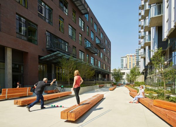
The logs move in a north-south direction, defining the programmed spaces and main walkway of the courtyard. To allude to the jumble of logs in a jam, the logs are at varying elevations, serving as benches, bench backs, markers in the pavement and unexpected sculptural elements in the landscape. In order to provide seating in the sun and the shade—something the design team observed led to successful open spaces in their tour of neighboring open spaces—the log jam benches alternate either side of the main walkway. Along the east side of the courtyard, the logs define planting areas of different heights. The higher planting area creates some visual separation to an amenity space at the base of the 12th Avenue building. The west side of courtyard is framed by a retail dock extending from 13th Avenue through the building and into the courtyard. This higher dock provides outdoor spill-out space and views into the courtyard. Logs are mounted to the dock wall to create visual interest and to minimize the height of the wall.
Referencing the history of the site, the logs are salvaged structural columns from a 100-year-old warehouse that occupied the site prior to its redevelopment. The columns were selected, stored off-site, cleaned and milled before installation. Playing off the industrial history of the neighborhood and the timber industry, the logs are mounted on wide flange beams and anchored with steel straps. Linear lights in the ground plane and bench surface add to the log jam geometry, emphasizing the movement of the objects through the publicly accessible space. Concealed lighting below the elevated benches add to the overall lighting of the courtyard, while also creating a shadow line so the logs appear to float.

Portland’s stormwater code requires all pollution-generating surfaces be routed through various means of flow control. Rather than lose valuable, usable square footage at the surface to stormwater planters, the design team thought of creative, alternative ways to treat stormwater. Due to the grade change across the site, there was a considerable amount of volume between the structural slab at the top of the parking garage and the finished grade of the courtyard. Working closely with the civil engineering team, the design proposed routing the courtyard surface runoff to a sand filter set between the structural slab and the finished courtyard. The sand filter was depressed an additional six inches and a bocce court surface of crushed oyster shell applied across the top, thereby creating a stormwater management strategy that is also a programmable and usable surface. Around the perimeter of the court, steel plate is held off from the edge of paving by three inches and back-filled with river cobbles, creating an exposed French drain to direct surface flow to the sand filter, as well as a visual aid to indicate the drop in finished surface elevation, and a convenient spot for bocce balls.
The run-off from the building roofs is directed to stormwater planters on either side of the courtyard. Where possible, the planters are recessed to create variations in planting heights while still providing clear sightlines. A mix of native and adapted plants were selected for the courtyard, with the design intent that taller species of plants would aggregate at the pinch points between the logs like material collecting in the intersections of a log jam.

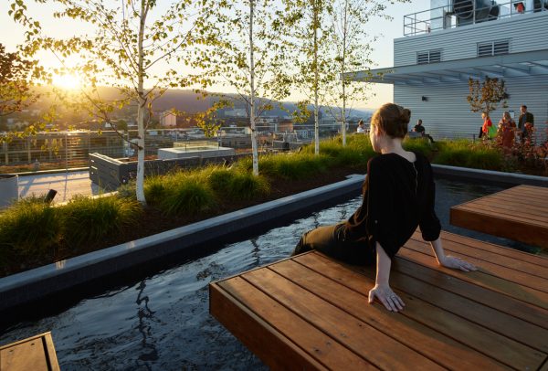
The concept of the heartwood and seedling is further expressed on the rooftops of the buildings. Providing an amenity space for the building’s users, the 12th Avenue roof offers unparalleled views of the city. This space is defined by one large central planter, emerging from the roof with a banked wall that expresses the idea of upward growth. On one side of the planter are more intimate wood platform seats over a shallow pool. The other side of the planter expands to provide multiple gathering spaces around a fire feature and outdoor kitchens. A further roof space provides community garden plots for building residents.
Recognizing that the 13th Avenue roof would be visible from the neighboring 12th Avenue building and other high-rise development, it felt like an opportunity to be playful with the green roof required to meet stormwater code. The roof design expands on the project concept further, organizing drifts of plant material to create a pattern similar to that of wood grain. Where the roof slopes, creating areas of greater soil volume, large perennials and shrubs are planted to give more seasonal color. In contrast, drifts of river cobble and sedums create patterns in the shallowest portions of the roof. Set within the planted wood grain are outdoor gathering spaces for the office building’s users. Consistent with the theme, the finished surface of the gathering area is a cumaru wood tile, wrapping up to wood benches in select places. The overall impact of the vegetation pattern, while striking to look down on, also created surprisingly nice impact to gaze through.
While starting with distinct architectural styles to relate a project to its immediate context, it was in the end, the fifth elevation of the landscape that sets the project apart and ties it into the neighborhood as a whole.